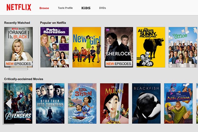
Netflix Gets A New Redesign
 Photo: Courtesy of Netflix.
With Amazon Prime sharpening its sword and Verizon lawyering up, not even an It streamer like Netflix can rest on its signature-red laurels. It's gotta keep its look fresh, and that's exactly what the site's new redesign set out to do. But, does it work?
Listen, we're not going to tell Netflix it got a trim when it says it got a haircut, but this revamp is just barely enough to be noticed. And, we're sure that was intentional, because people hate, hate, HATE change. The red background has faded to gray, the nav bar is now like a white cumulous cloud floating across the top of the screen (kidding, it's nothing like that), and the logo ditched its movie-theater-popcorn vibe for something a little more straightforward. All in all, the subtle changes are just fine by us. But, as long as we can still binge-watch OITNB, any digital transformation would be copacetic. (Fast Company)
AdvertisementADVERTISEMENT


