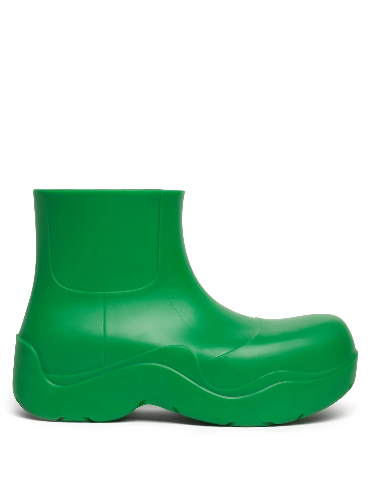
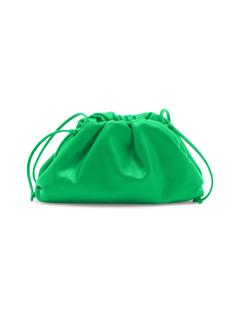
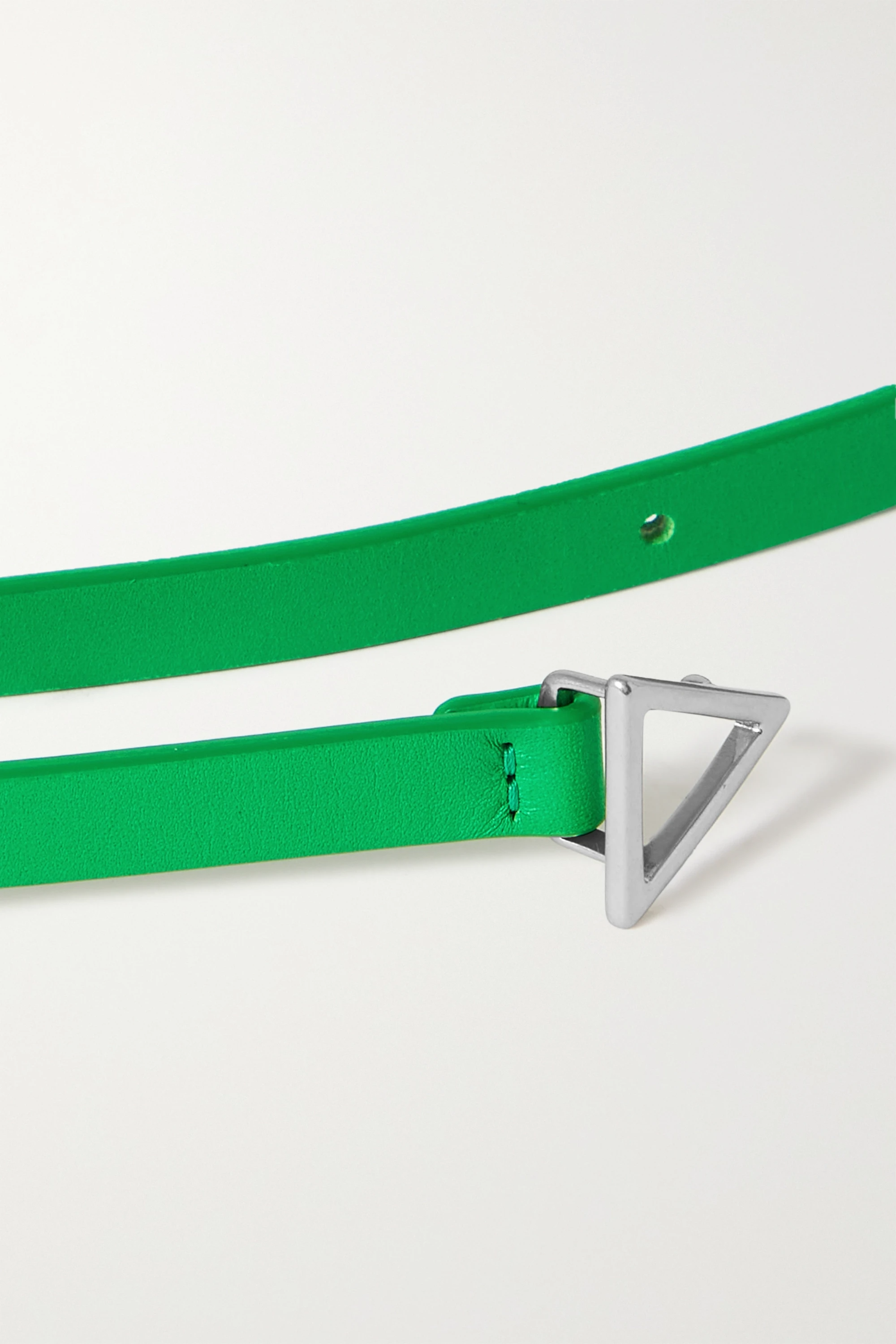
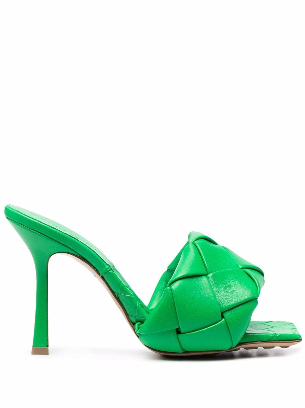
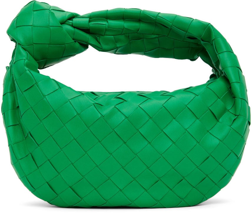
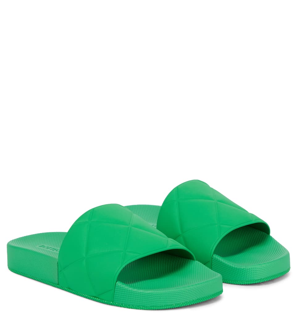
It was the color of the year — at least, it was for fashion types. Few cared about Pantone’s gray and yellow when there was “Bottega Veneta green” to covet. While former designer Daniel Lee had toyed with the color in earlier collections, he went full-throttle with the shamrock creations at the brand’s Spring 2021 show. Models walked through a green room wearing green knit dresses and green leather shoes. There were green suits and green bags. While arriving at the tail end of Lee’s three-year stint, it was this vibrant green — along with the previously released Pouch bag and Puddle boots — that grabbed attention and skyrocketed the Italian luxury label (which Lee called “a sleeping giant” at the start of his tenure) to unprecedented popularity. It was the green that many wondered about, too, when Lee’s sudden departure from the label was announced last week. “No more BV Green?” tweeted New York Times fashion critic Vanessa Friedman on November 10. “No more pouch bag? Oh boy.”
AdvertisementADVERTISEMENT
While a new creative director, Matthieu Blazy, has already been confirmed, it’s unclear what this shift means for Lee’s legacy at the company. Will Bottega Veneta continue to embrace this specific shade of virally hyped green? Will Blazy want to introduce his own colorway, perhaps a Blazy Blue?
It would be naive to pretend as though BV Green was created in a vacuum, a sole product of Lee’s imagination, especially since big bold greens have been bubbling up in the collective consciousness for several years now. The most official color of the past decade was Greenery, Pantone’s 2017 color of the year. Then there was “neo-mint,” a weird, slightly off-putting seafoam-y color that was hailed by interior designers as the next big thing. For me, the most influential green was found on Dakota Johnson’s kitchen cabinets, but I realize that’s a niche obsession. (Though that Granny Smith color did show up frequently on the backs of avant basic influences, thanks to Instagram favorite brands like Paloma Wool and House of Sunny.) The most likely predecessor to BV green though is "slime green." For a few years, that highlighter bright, bratty, and brash green was everywhere. It somehow felt like an antidote to the peach soft tyranny of millennial pink. Slime green wasn’t gentle and natural. It was loud, obnoxious, and self-aware. It was a digital green, reminiscent of ‘90s aesthetics and early internet culture. It was kind of ugly. That was kind of the point.
Green in general has a reputation for being hard-to-wear, which is probably due in part to its history as a color of wickedness, witches, sin, and ghosts. (Yes, ghosts.) From the start, slime green was a statement color, as is BV’s matte, bold green. It wasn’t the only green that Lee used at Bottega Veneta, but, perhaps because of its similarity to slime green, it’s the one that mattered most.
AdvertisementADVERTISEMENT
If you go to the Bottega Veneta website and try to order one of their distinctive woven leather bags, you’ll find a couple of different green options. There’s the minty, pastel hue called “fountain,” the teal one dubbed “mallard,” the bright emerald “racing green,” and finally, there’s “parakeet.” It’s this last one that made the biggest impact, appearing on everything from the brand’s leather goods to knitwear and ready-to-wear. It’s the color favored by Hailey Bieber, who has been photographed wearing a *distinctive* pair of Bottega Veneta feathered jeans. She’s since posted more evidence of her parakeet love to Instagram, showcasing the brand’s leather bags, puffer vest, and shoes.
What is parakeet? As far as I can tell, it’s Kelly green with an avian name. (While I don’t claim any great expertise on budgerigar as a species, I do think their feathers tend to look a bit more brown; and I can say with absolute confidence that there is not a parakeet on earth that looks like Bieber in a leather puffer, unfortunately.) It’s flatter and more saturated than the neon-loud slime green. It’s lighter than emerald and shamrock, more yellow than mallard, less yellow than chartreuse — or, as BV, calls the latter, “kiwi.” They could have called it Kelly green so close is the match, but that doesn’t sound all that grand or exciting. Perhaps if the brand had known how hard this green would have hit, they would have just called it “Bottega Veneta green.”
AdvertisementADVERTISEMENT
The back story of the hue goes something like this: According to etymologists, Kelly green comes from a common Irish surname, and while people in America tend to associate it with sports teams and St. Paddy’s drinking culture, it was once a rather meaningful color for the Irish independence movement. In the late 18th century, it became a symbol for the Irish Home Rule movement. It’s still on the Irish flag today, separated from the orange stripe by a swath of white. (Given that Lee is English and Bottega Veneta is Italian, it’s unlikely that there is any historical significance behind the hue for either.)
The color’s use (and Lee’s work in general) marked a turning point for Bottega Veneta’s public perception. This was never a brand known for loud statements. In 2008, the New York Times cemented the “stealth wealth” designer status of Bottega Veneta in an article titled, “You’ll Know How Much You Spent.” In contrast to immediately identifiable logo bags, Bottega Veneta leather goods were never designed to advertise their owners’ wealth. They were intended to showcase taste.
Under Lee’s tenure, the brand did things a little differently though. Bottega Veneta was both more and less visible. It could disappear from social media, yet its buzzy pouch bags showed up on so many influencers that Fashionista launched an investigation into the phenomenon. The bright green was likewise hard-to-miss, popping up not only on It girls everywhere but even in the form of an installation in Seoul. It was instantly recognizable, unique enough to stand out but never too alienating. It was versatile, too: On some, that green looks preppy and traditional. On others, it looks subversive and cool; on leather, the Kelly green looked dramatically incongruous and rather sculptural, while on knits, this color seemed fuzzy and muppet-like, a Kindercore dream. It should be noted that all obscenely bright colors have this chameleon effect, but green feels somehow more interesting than Louboutin red or Hermes orange.
AdvertisementADVERTISEMENT
Yet it’s a familiar color, too; the color of a well-kept lawn. And, like a freshly mowed, expertly fertilized patch of grass, it’s not quite natural. To me, this green equivalent of topiary. Nostalgia, controlled, a little bit surreal, alive. Most importantly (at least for the financial success of a brand), it had the power to transform ordinary objects, like a pair of utilitarian rubber rain boots, into an instant hit.
Color trends are notoriously hard to predict. It’s not just enough to pick a pretty color — it’s about how it interacts with textures, how it reflects light, how you describe it, how you present it, how you see it, and, perhaps most significantly, what new associations you can create between a color and a culture. So while it doesn’t matter whether you call the color parakeet or Kelly green or BV green, it will always be the hue associated with associated with Lee’s time at the company.
BV green is nothing special, yet during the summer of 2021, it was the only color that mattered. It captured the zeitgeist, the sense of relief that many people were feeling, the desire to re-emerge into public life and make a big splash, the desire to be one with nature. If Blazy abandons the hue, the remaining items might become even more enviable, coveted and resold for years to come like Tom Ford’s Gucci pieces or Marc Jacobs’ Louis Vuitton designs. Or it could be a flash-in-the-pan, a color trend that disappears as quickly as Lee departed from the company, gone like Gen Z yellow and melodramatic purple. It’s hard to know. Personally, I hope it’s indicative of a turn towards sharper, more defined colors, shapes, and looks. Pastels dominated the pre-pandemic years with their wishy-washy ways. It’s time for something new to take root.
At Refinery29, we’re here to help you navigate this overwhelming world of stuff. All of our market picks are independently selected and curated by the editorial team. If you buy something we link to on our site, Refinery29 may earn commission.
AdvertisementADVERTISEMENT


