


Unless you’ve fallen out of a coconut tree, you’ve heard of Brat Green. While pop queen Charli XCX dropped her most recent album, Brat, on June 7, in the weeks since, the electric shade of green has filled feeds everywhere. In most recent events, the color transcended pop culture fodder and made political news headlines when, upon Joe Biden’s withdrawal as the Democratic nominee and endorsement of Kamala Harris, the British singer-songwriter took to X (formerly Twitter) to declare: “Kamala IS brat.” Harris’ campaign subsequently hopped on the train by adopting a banner featuring the same color and font as the Brat album cover for the KamalaHQ account.
AdvertisementADVERTISEMENT
I find the color’s sudden popularity annoying, but not in a vicious way. There’s a snicker crackling in the background of my emotions, a smirking acknowledgment that this trend has legs. This is partially because lime green, chartreuse, slime green, and similarly vibrant verdant shades have been in style for almost a decade. And, while I first wrote about the color phenomenon in 2018, I remember it from even before that — when I was hanging out on a couch that color during an after-school program as a kid, and using my grandma’s bright avocado green dishes.
Like so many recent trends, you can find a precedent for its sudden summer explosion in the Lisa Says Gah archives, which is what grown-up Limited Too girlies are wearing for the summer (when they’re not in Ganni, that is). Neon green hair had a moment in 2017 and 2018, with celebrities like Kelis and Chloe Norgaard temporarily donning the look, before Billie Eilish solidified it as her When We All Fall Asleep, Where Do We Go?-era signature. In 2020, Etsy named chartreuse its color of the year. “I predict we’ll see this tone showing up everywhere from our home decor to our wardrobes,” said the prescient Etsy rep Dayna Isom Johnson at the time. A few years later, in 2023, Fendi showed a spring collection filled with yellowish-green pieces, which seemed to glow against a backdrop of restrained taupe. (In an unexpected color pairing move, Fendi also used a metallic mauve that looked unexpectedly good with their floaty chartreuse gowns.)
AdvertisementADVERTISEMENT
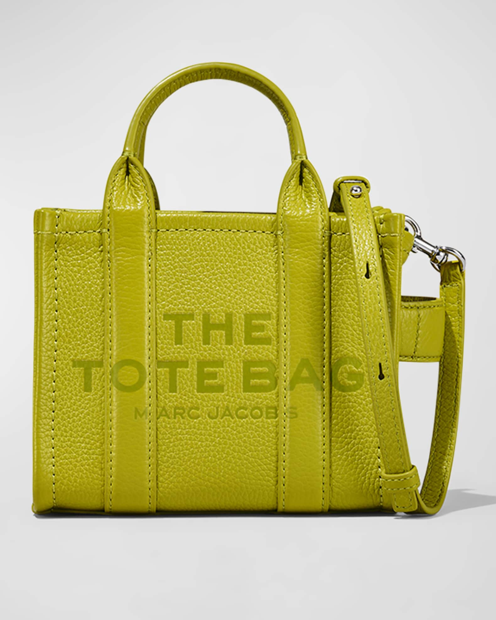
And of course, there are brands that never stopped playing with lime green, like preppy standby Lilly Pulitzer, who likes to pair its parakeet shade with flamingo pink in a nod to the tropics. On a different note, Marc Jacobs has been highlighting the punk side of the hue since the ‘93 collection that got him fired from Perry Ellis but, more recently, used it on a particularly good pair of ballet flats made in collaboration between Heaven By Marc Jacobs and Sandy Liang.
After the reign of Barbie pink and the flash in the pan that was Gen Z yellow, I’ve become desensitized to the screaming loudness of neons. But, despite my earlier proclamation, I’m not mad about a new version leaping onto the scene. It’s annoying, yes, but in the same way that a sibling can be obnoxious; they tease you because they know you like it, even when you hate it. It’s just the way of certain family members and certain colors.
So, what is Brat Green?
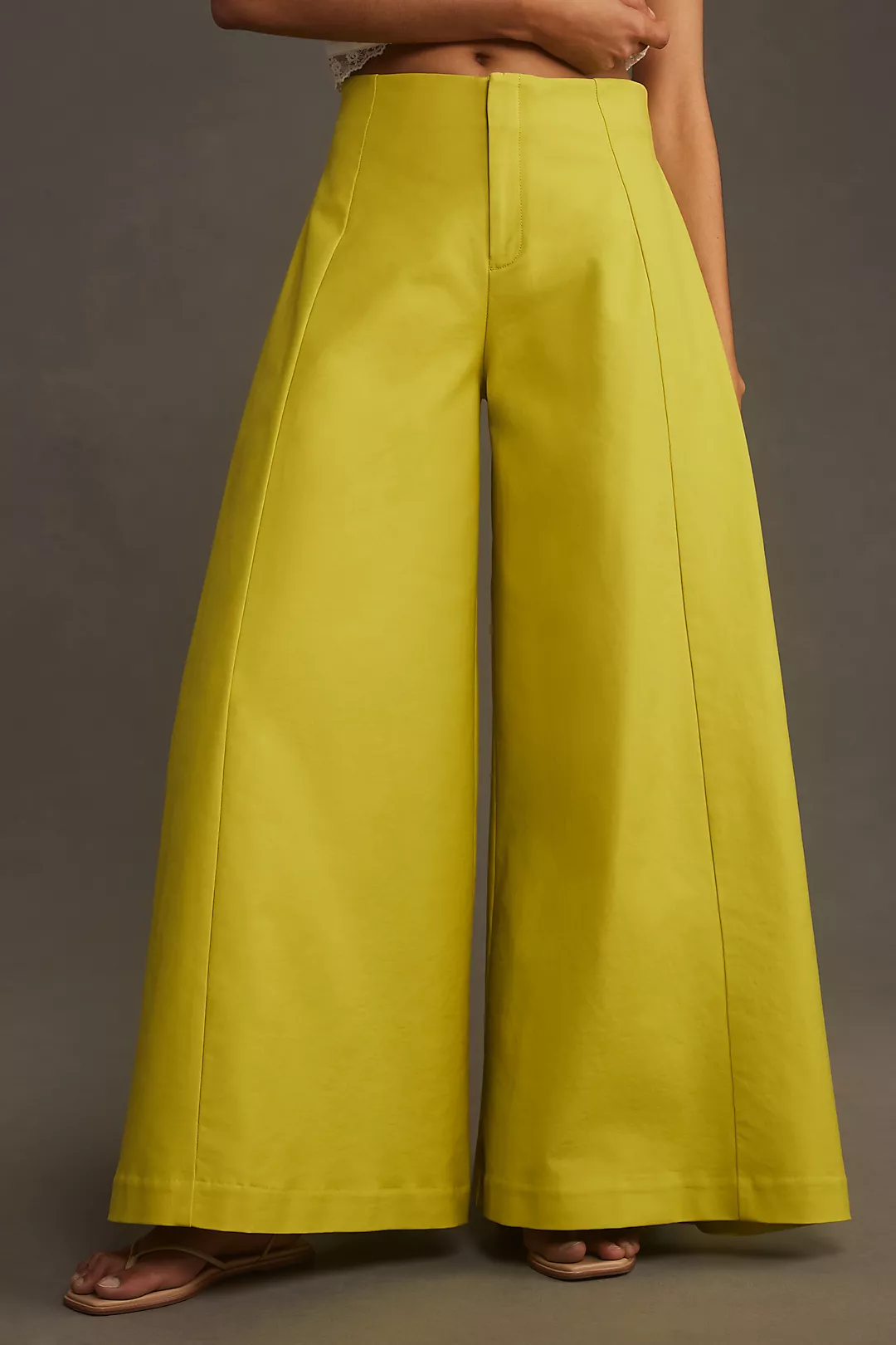
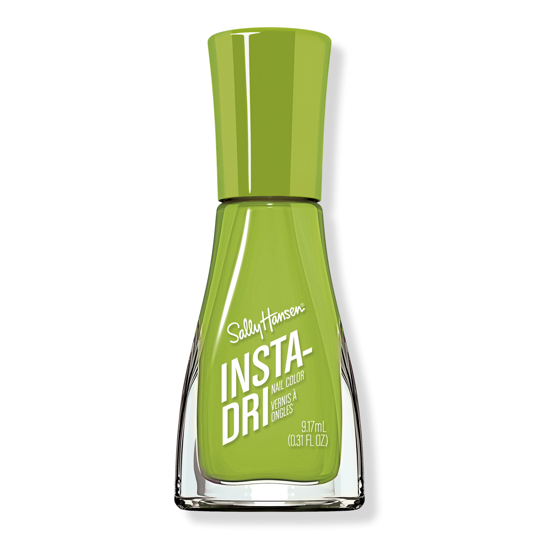
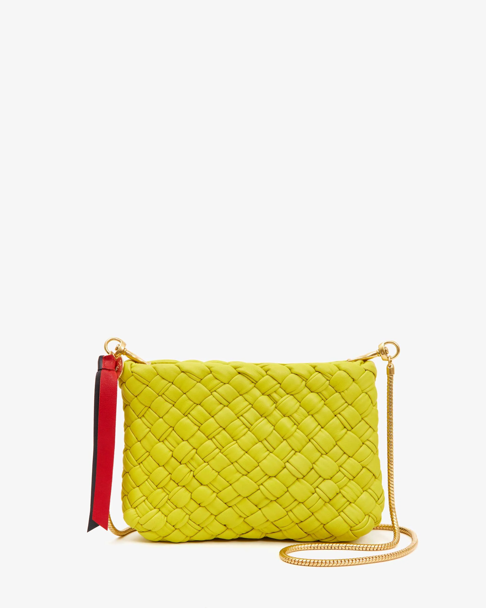
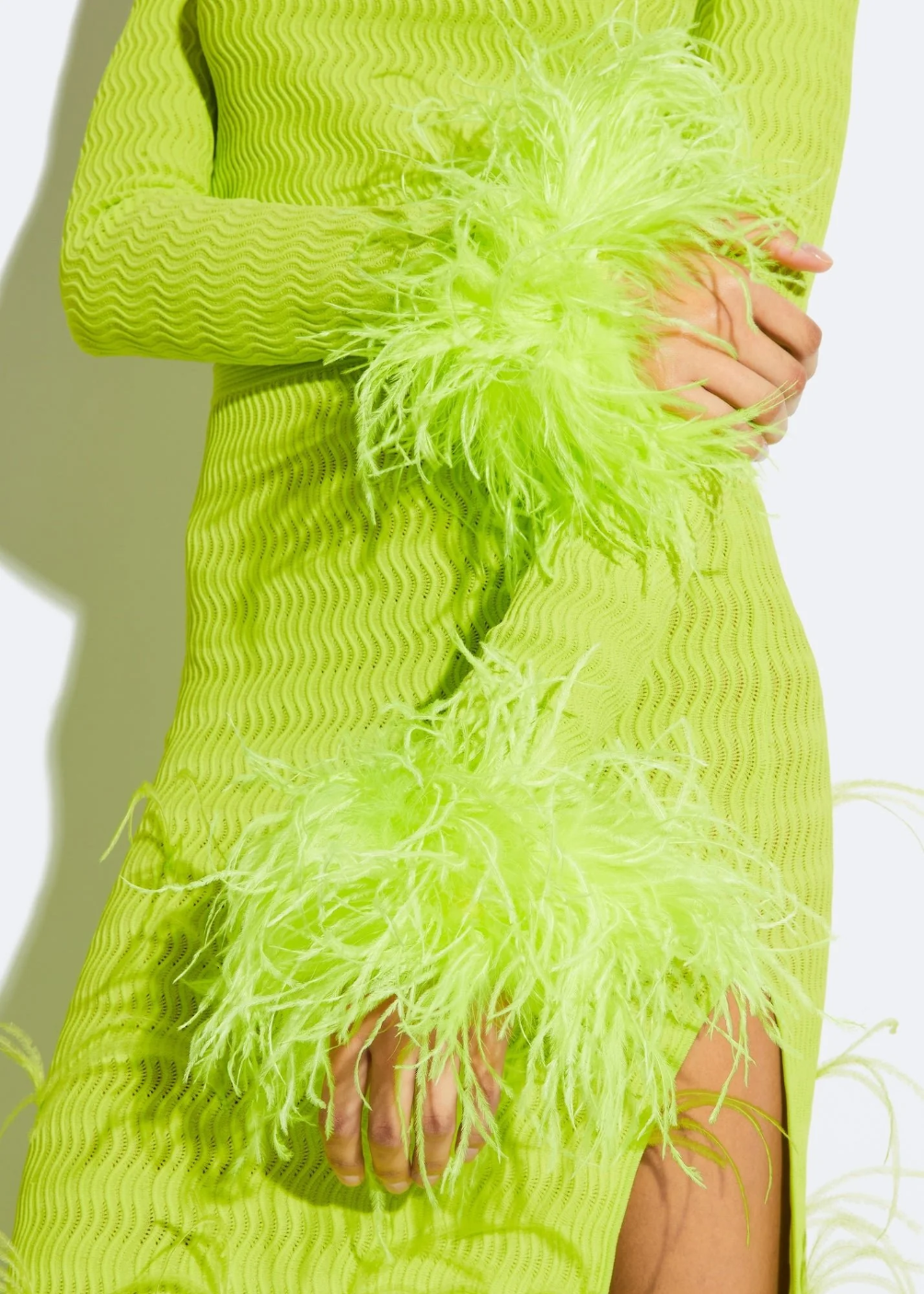
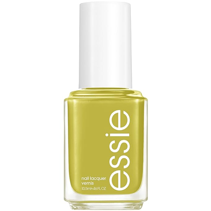
It’s very nearly lime green, though it has less blue and a little more yellow than a traditional lime, which leans closer to emerald (Brat skips up to apple). It’s a slightly updated chartreuse, almost the color of the famous liquor, but with a heavy saturation that marks it as far more modern than the version that blew up in the late 1800s (and again in the 1920s, 1960s, and 1990s). It’s not quite an absinthe green or a pickle green, but it is close. It lacks the depth of those vintage greens, which gain dimension from a touch of ochre, but that’s exactly why we like Brat Green. It is not a complex color, nor is it intended to be. Like the slime green made famous by Nickelodeon, Brat Green is pushy and straightforward. It’s supposed to be brilliant, intense, and rich without being mistaken for tasteful. There’s a flatness to brat green that makes it well suited to black light dance parties, color field paintings, and online life (see the various social media memes the color spawned even before Harris’ “Brat-ification”). In particular, the digital nature of brat green shows when you open up a messaging app and text your friends — it’s right there, in Apple’s lime green chat icon with its little white bubble. It’s also just a whisper away from Spotify green, something I doubt is accidental.
AdvertisementADVERTISEMENT
That’s not to say you can’t find brat green in nature. This grassiness is part of its brattiness; this crabgrass color speaks to summer lawns and popsicle stains and long days spent with nothing to do except flop on a picnic blanket or pick up a racket. (A slight tangent: If you want to smell like brat green, can I suggest Imaginary Author’s The Soft Lawn, a perfume that smells like linden blooms, vetiver, oakmoss, and fresh tennis balls.)
I’ve always associated this color with spurge, a groundcover that has the brattiest flowers I’ve ever seen, lacking the softness of petals and sepals, and instead defined by modified leaves called “bracts.” Spurge grows easily and everywhere, and it isn’t usually pretty. It’s colorful and a little rough, perfect for public spaces like medians and grocery store parking lots. Another plant in the family is the pencil cactus, which also goes by the name “firesticks.” This pokey lime green plant is a bit of a chameleon, changing color when stressed by lack of water or bad weather. Its long fingers turn vibrant yellow or neon pink, contributing to its oddball appearance which I find rather charming.
Even though brat green is the precise color of both blue spruce tips and birch leaves in the spring, I still associate it with the tropics. Perhaps that’s because sap green is so fleeting in the colder parts of the world. In New England, you only get a sliver of this green brilliance. In Florida, you don’t have to try and grow spurge or firesticks or wait for April showers. It’s why a paint color like Limeade makes sense in the south. Climate doesn’t just influence fashion — it shifts all the shades of our built environment.
AdvertisementADVERTISEMENT
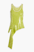
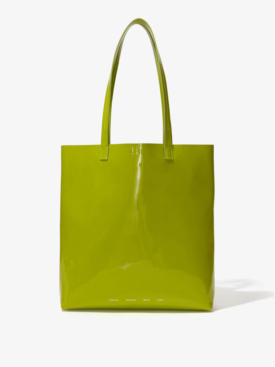
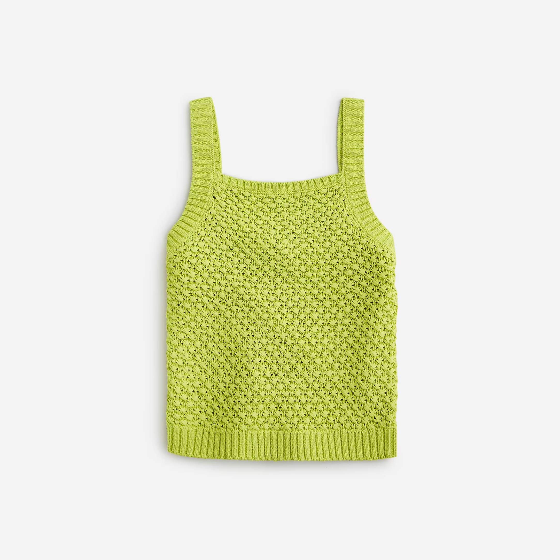
Perhaps this is why we’re loving brat right now: We’re finally embracing the heat and chaos of the 21st century. I know I said neon greens have been in for a while, but this color does feel distinct. You can compare it to chartreuse, lime, and acid, but it’s none of those exactly. It’s not recycled from the past, though it does have a Y2K vibe, and it can feel a bit ‘60s at times. But brat green is fun and fresh partially because it’s so available. These days, you can buy lime green from retailers as mainstream as Dolls Kill and as niche as Doen. You can decorate with it (the perfect seating for a brat is on a chubby, childish Mario Bellini single-person sofa), eat it (cake or hot dog, your choice), and play with it (fancy a lime green ride or a bucket of slime?). So everyone can join in on the fun.
As I write this, my five-year-old daughter is sitting on the floor watching an episode of Wild Kratts on PBS Kids. They’re currently arguing about whether green or blue is better, since the two main cartoon characters are distinguished by their single-color outfits. One wears shades of emerald and lime, while the other wears pool blue and slate. I’m not claiming that this cartoon has anything to do with our current trends, but it’s a reminder of how deeply childish and easily relatable color trends tend to be. We can pontificate all we want about what causes a color to explode when it does — the answer is usually just companies trying to sell us stuff — but at the end of the day, we all just enjoy jumping on a bandwagon and proclaiming a new favorite color. It was easy enough to do as a kid, and it’s just as appealing now that we’re grown.
AdvertisementADVERTISEMENT