ADVERTISEMENT
ADVERTISEMENT

Katie Sturino’s Newly-Upgraded Apartment Has Puppies, Pattern, & Plenty Of Space For Hustling

Photographed by Erin Yamagata
Katie Sturino and Gunnar Larson.
Life can change really quickly. Apartments, however, have a bad habit of staying the same long after they’re due for an upgrade. For example, when body positivity advocate and Megababe beauty founder Katie Sturino moved into her apartment four years ago, her now-thriving company did not exist and she had yet to meet her husband, John Forkin Sturino, whom she married this June. Since then, Sturino says, she’s made a few much-needed tweaks to the space, which she also uses as an office (and a home for the couple’s three dogs), like getting a new, post-wedding couch and replacing rugs. And yet, the Chelsea apartment still wasn’t exactly what the style-conscious newlyweds had in mind. 
AdvertisementADVERTISEMENT
Photographed by Erin Yamagata
“I think the apartment was no longer cohesive, and storage systems that worked in the past were no longer holding up,” Sturino tells Refinery29. 
In an effort to change that, she tapped Gunnar Larson, an interior designer who has worked with the likes of fashion designers Rebecca Minkoff and Timo Weiland, as well as Grammy-nominated songwriter Scott Harris. (He also designed his own family’s chic, super space-saving nursery setup.) “I always feel like my house is so cluttered, and I really wanted it to feel lighter and brighter,” Sturino explains. “When I first moved in, I cheaped out on some items and couldn't commit to any curtains (I got used to an open gap of a window with no shade between me and my neighbors!). I wanted to bring the way the super fun wallpaper in my bedroom brightens up a room into the living space, and we achieved that.”
Photographed by Erin Yamagata
Before.
Photographed by Erin Yamagata
After. Wallpaper: Christene Barberich x The Inside, Media Cabinet: Room and Board, Rug: Flor, Curtains: The Shade Store.

We can certainly relate to the feeling of moving into a place, buying what we think we need to survive, and then kind of… forgetting about some other, equally crucial details like, say, curtains. Thankfully, Larson was able to remedy this problem using patterned ones from Jonathan Adler’s collection for The Shade Store. And thanks to pink striped wallpaper from The Inside’s collaboration with Refinery29’s very own global editor-in-chief Christene Barberich, he was also able to turn the Sturino’s much-used living space into one just as fun and on-trend as their beloved bedroom. 

“When I asked Katie what a happy day looked like to her, two places of inspiration came up in conversation; the Veronica Beard store and the Mezzatorre Hotel in Ischia, Italy. These two places really were the jumping off point for this makeover,” Larson recalls. Because Sturino uses the space as an office, Larson also drew inspiration from the classic fashion mag concept of “day-to-night,” or “desk-to-dawn.” 
AdvertisementADVERTISEMENT
Photographed by Erin Yamagata
Before.
Photographed by Erin Yamagata
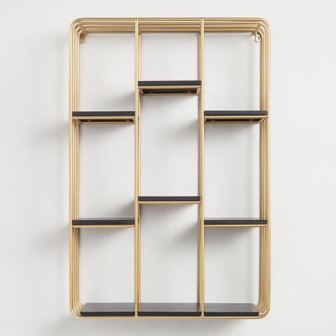
After. Wallpaper: Christene Barberich x The Inside, Fireplace Screen: Crate & Barrel, Fireplace Paint: Rust Oleum, Fireplace Side Shelf: World Market.
“I wanted to use pattern, color, and prints to make this feel like a modern day well layered Upper Manhattan townhouse. Inspiration was that of beautiful townhouse dressing rooms with leopard print carpet and over the top prints on custom furnishings,” Larson adds.
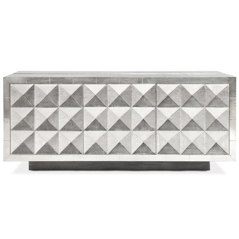
With a living/dining area that clocks in at just 285 square feet, Larson and Sturino had to get creative to solve her storage woes. “I wanted to give Katie as much storage as possible for her Megababe products but keep it feeling like a living space,” Larson explains. To do this, he employed Room & Board’s Steen Storage Cabinet, an elegant solution that sits under the couple’s TV. For the dining/conference table, they went with Jonathan Adler’s Jacques clear acrylic option, which makes the area feel more open than more traditional option might. Larson also added two nightstands to the area, which provide room for a printer and drawers of office supplies. 
If creating ample storage options was the makeover’s biggest challenge, Sturino’s innate sense of style and desire to play with print and pattern was its guiding light. The one part the interior designer and his client initially disagreed on? A mounted TV, of all things. “I fought him hard about mounting the TV because I thought it was unnecessary, but it actually created a super clean surface I didn't know I needed or had!” she reveals.
Photographed by Erin Yamagata
Before.
Photographed by Erin Yamagata
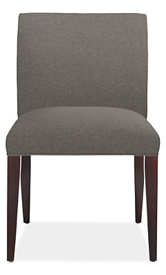
After. Wallpaper: Lulu & Georgia, Table: Jonathan Adler, Chairs: Room & Board, Curtains: The Shade Store, Lamps: Jonathan Adler, Decorative Objects: Hoppe Shoppe.
Larson says his favorite part of Sturino’s new pad is a detail you might not immediately pick up on: the fireplace, which was painted using Soft Gold Metallic Paint from Rust-Oleum. While most fireplaces are left bare or covered with neutral color like white, this metallic accent lends an air of glamour to the space, which is exactly what the duo was aiming for. 
AdvertisementADVERTISEMENT
As for how Sturino’s husband John feels about the makeover, she says he’s very happy with it. “I am so grateful that he has as adventurous a sense of style as I do!” she shares. “When I was picking up patterns for wallpaper, people would ask me ‘doesn’t your husband care?’ But he loves color! He’s not scared of pattern or pink!”
If you, too, are looking to cultivate a fashion-forward environment, Larson recommends shopping H&M Home’s collaboration with Jonathan Adler, which dropped earlier this month. Adler’s more-is-more sensibility is beloved by fashionistas, and just because you’re working in a smaller space doesn’t mean you have to go minimalist. Whether it’s your first apartment or a mortgaged home, Larson and Sturino’s philosophy is: why not have fun with it?
Photographed by Erin Yamagata
Before.
Photographed by Erin Yamagata
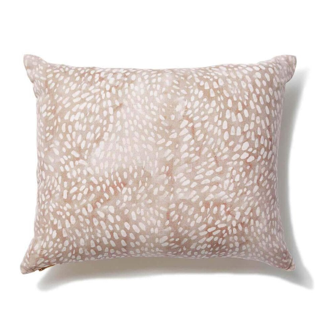
After. Sofa: Room and Board, Pillows: Rebecca Atwood, St. Frank.
For renters, Larson also suggests trying out stick-and-peel wallpaper, which allows you to experiment with patterned walls without the commitment (or the angry landlord). It’s also often cheaper than permanent options. “Every project has a budget, but make sure you put your money to what you use the most,” he offers. “Investing in a good sofa and chairs is always great to do, your body will thank you! But to please the wallet, shop around for more cost friendly coffee tables, side table, and decorative objects.”
All photos by Erin Yamagata.
Related Content:
AdvertisementADVERTISEMENT

More from Home

ADVERTISEMENT