3 Design Tips For Giving Dated Spaces More Modern Charm
In Refinery29’s Sweet Digs, we take a look inside the sometimes small, sometimes spacious homes of millennial women and their families. This week, we tour the first-floor renovation of a 1932 Cape Cod in Long Island, where a updated layout brought new life to the vintage cottage.
You may already know Jamie and Fillip Hord, thanks to the addictively neat Instagram account they run for their professional-organizing business aptly named Horderly. The pair spends their days decluttering clients’ homes; overhauling overstuffed closets, calming chaotic pantries, and creating color-coordinated oases. It, therefore, came as no surprise when they purchased a 1932-built, brick-Cape-Cod-style cottage with plans to revamp it to accommodate both their business — which they run from home — and their leisure time. Below, the duo walks us through all the clever renovation tricks of the trade they employed in transforming this dated-and-boxy home into a thing of vintage-meets-modern beauty.
AdvertisementADVERTISEMENT
Use deep colors and personal objects to make stuffy spaces feel more intimate...
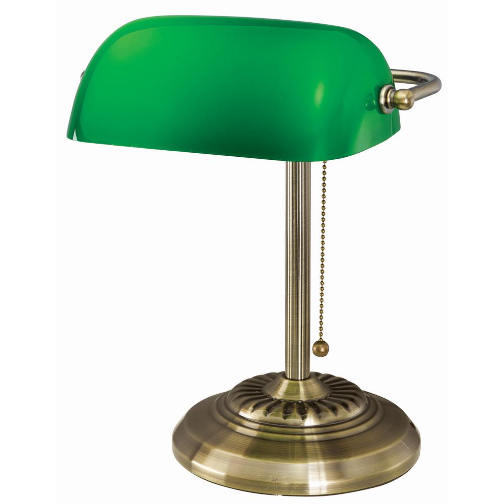
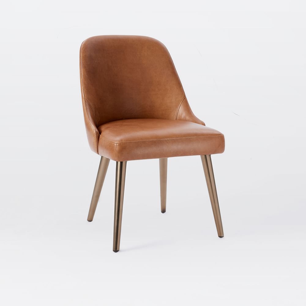
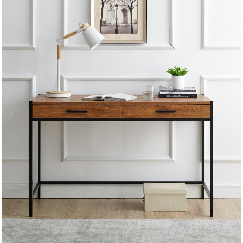
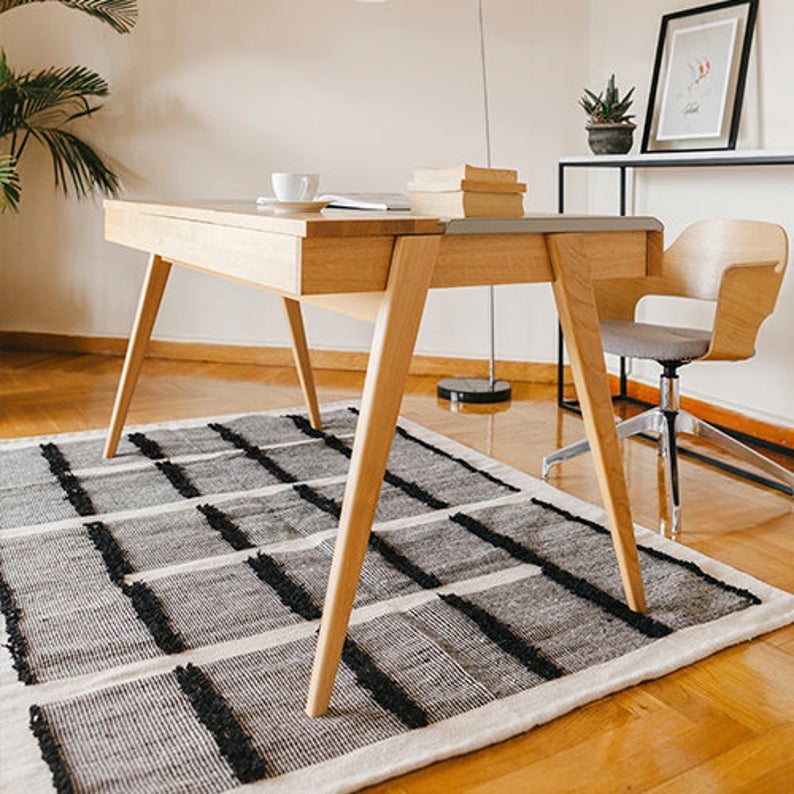
For Fillip’s office, the couple used a deep, moody green and Victorian-inspired framing to create a bold, welcoming space. “The design was inspired by all of Fillip’s favorite hobbies: reading, whiskey, and Winston Churchill,” says Jamie. “It has a library feel,” Fillip explains. The dark wood desk provides a functional workspace, while also adding a studious background ambiance for the virtual meetings that the couple conducts throughout the day. Leather furniture and accent pieces with a curated, flea-market feel add to the room’s intimate, bookish air.
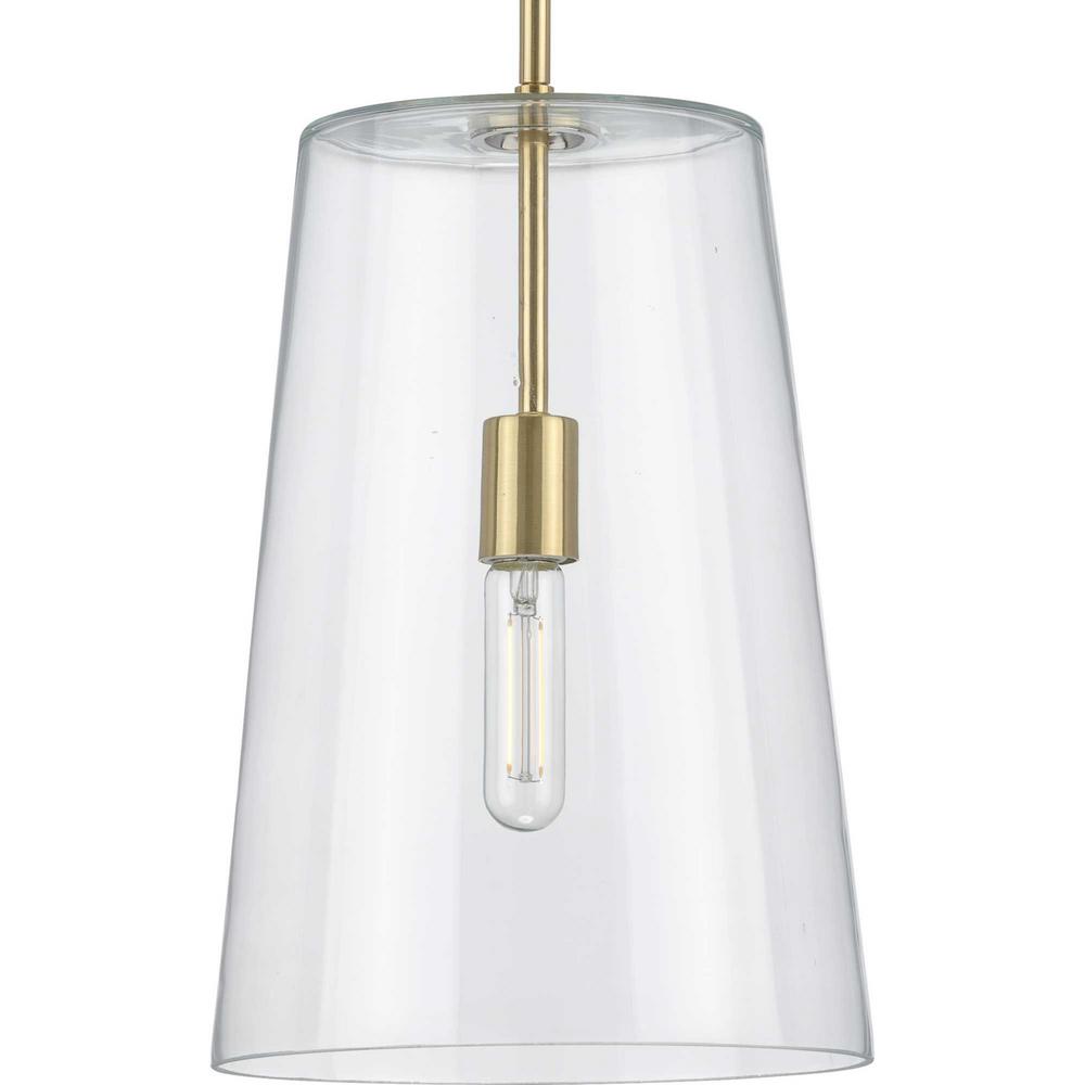
Update hardware and lighting fixtures for a more modern aesthetic...
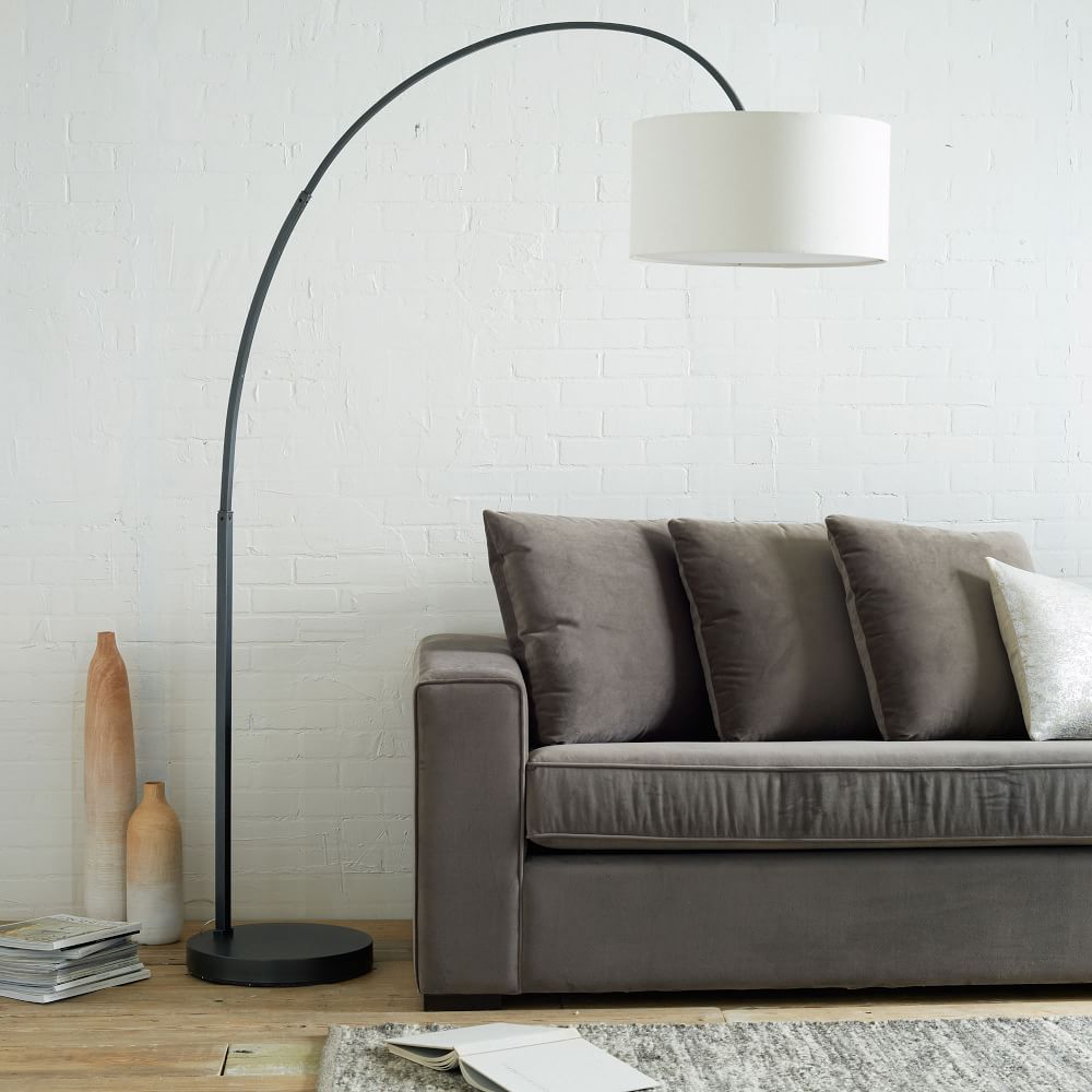
The gleaming, brass-accented kitchen, on the other hand, fulfilled one of Jamie’s longtime design desires: “[She] always wanted a white kitchen, so this is like a dream come true,” explains Fillip. The space is filled with light thanks to the removal of multiple walls that surrounded the formerly small, boxed-in zone, creating an expansive space that still felt “easy to navigate,” according to Fillip. “With the walls down, it was like, holy cow — our house is twice the size that it was,” he marvels. In addition to brass and organic wood accents through the otherwise minimal space, the couple added high-tech creature comforts like a multi-functional faucet that can emit chilled, boiling, or sparkling water at the touch of a button. “It blows my mind every day,” says Fillip.
Layer neutral tonal textures and organic accents to make a room feel airy...
AdvertisementADVERTISEMENT
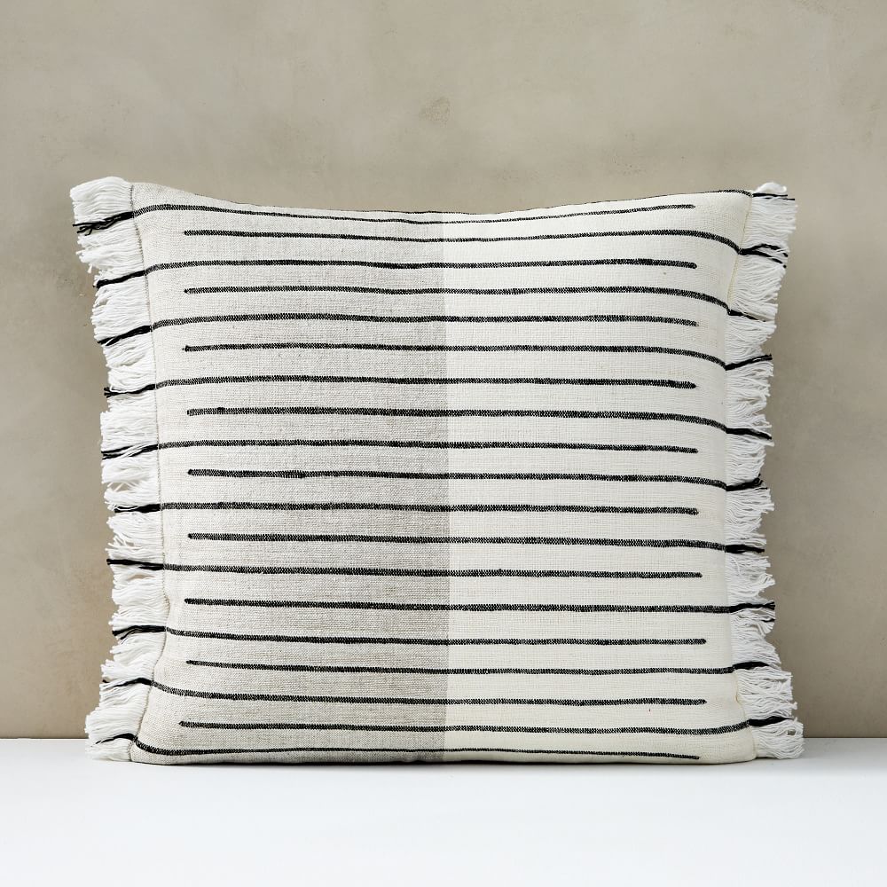
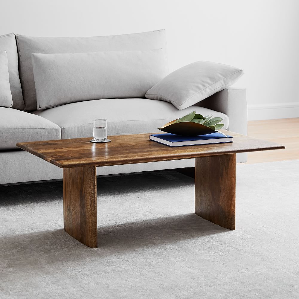
The cozy, neutrally-accented living area, says Jamie “is my favorite room in the house.” In a visionary move, she asked the contractors to increase the height of the ceiling, which exposed structural beams and added dramatic height to the room, creating ample runway for organic furniture like an expansive white sectional, solid wood coffee table, and hand-woven accent pieces in a pared-back palette of black and white. It’s a visually enticing space, but the couple’s philosophy dictates that aesthetics come second to creating a space that simply works. “When you plan on renovating,” explains Jamie, “it’s so important to think about functionality first.” Adds Fillip: “You don’t have to go for beauty first — with function comes beauty.
shop 6 products
At Refinery29, we’re here to help you navigate this overwhelming world of stuff. All of our market picks are independently selected and curated by the editorial team. If you buy something we link to on our site, Refinery29 may earn commission.
AdvertisementADVERTISEMENT


